The Story Behind the Photo
February 2024: Portrait with Hat or Scarf
Doug Budzynski
Since 2016, (except 2020 and 2024, both because of covid), my family and I have been attending Seattle’s Emerald City Comic Con (ECCC). I love to see all the different costumes that people create and it provides a fun time for taking pictures of the many costumes. I highly recommend anyone who likes taking photos of people, to attend. The atmosphere maybe busy, but the people are really relaxed and everyone that is in costume, loves to have their picture taken. I never hear a “No”.
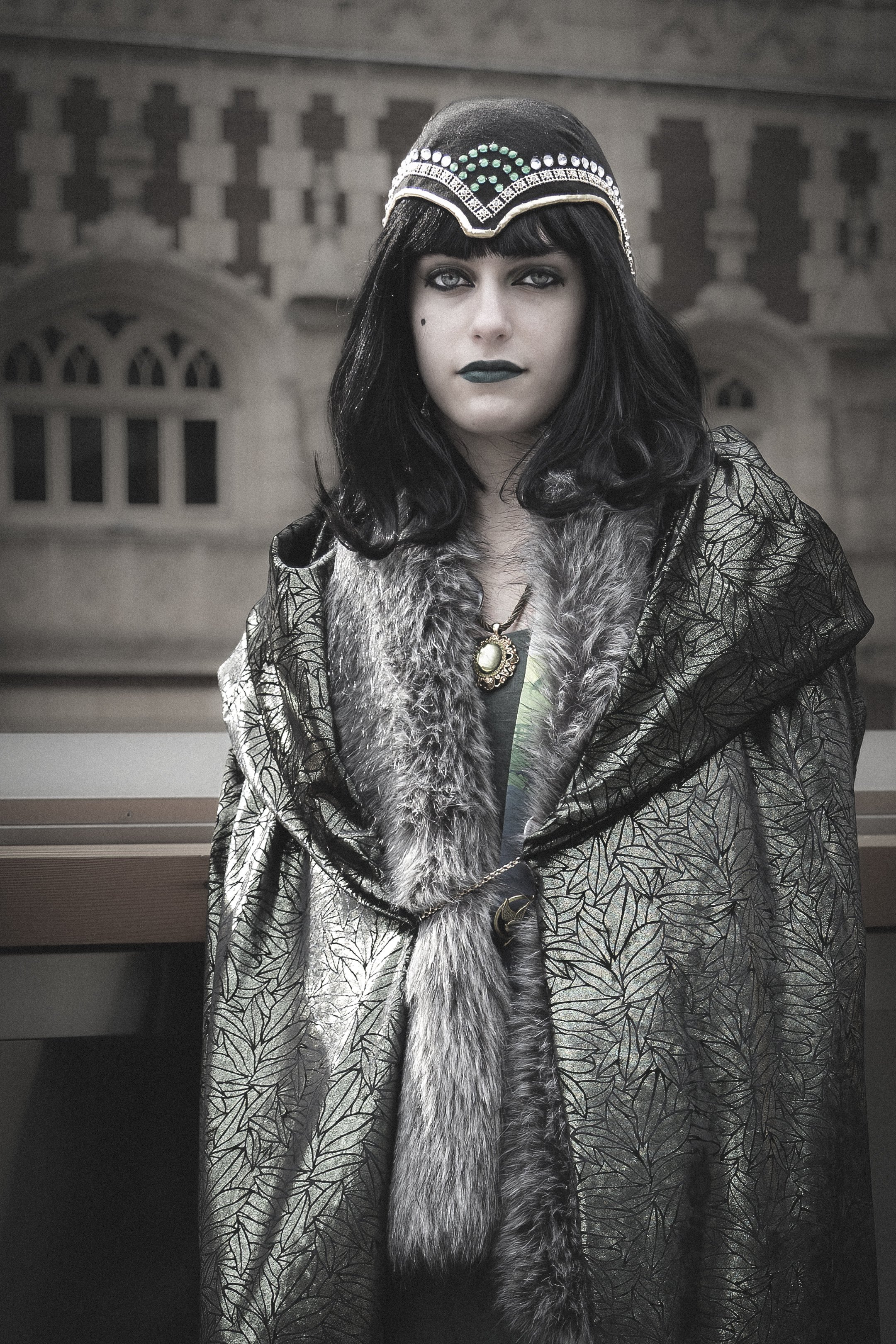
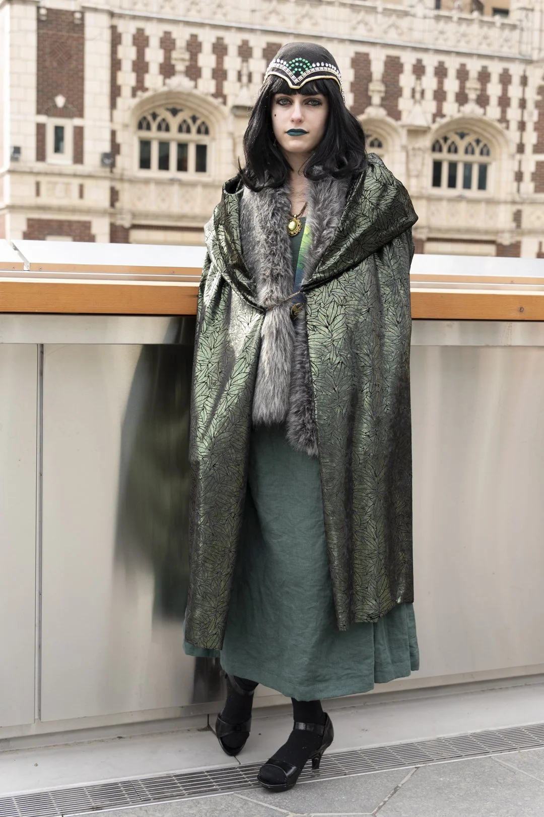
Each year my daughter who loves creating a costume and attending the scene. Last year, she started working on her version of Marvel’s character, Loki. She wanted the costume to portray a female’s gender version with a 1920’s twist. She didn’t get it completed in time for comic con, if you were wondering if there should be horns, but she still wanted to wear the outfit with what she had completed.
This is the image that was submitted.
Most often, the lighting and background at ECCC are not favorable for good photos, but if the weather is cooperating, there is a patio area where people like to congregate and the backdrop is much more pleasing. This picture was such the case. The rain had stopped and with the older buildings in the background, this worked with well with my daughter’s costume, setting that 1920’s mood.
The camera was a Sony A7III and with a Tamron 28-200mm f2.8-5.6 lens. Normally I use my 28-75mm f2.8 lens but we had an event that day where I needed the longer lens and the 28-200mm f2.8 lens does pretty well for the shorter length. I do carry a speedlight for certain situations but since I am not an expert with my speedlight, I often choose to leave the speedlight off. In the case of outside using the speedlight in highspeed sync, this has been an issue with my system, Godox, because I get banding, and only recently learned what was causing that and how to resolve that. For this shot, my settings were ISO 100, f4.5, 1/100sec.
All the touches I did were in Lightroom. I was happy with the general background but I wanted to make it less distracting. So, I darkened the background and gave it some out of focus look. For this particular entry, I cropped the photo, reduced the saturation and even added some grain back into the photo to give it a little of that old photo feel.
The image to the left is BEFORE editing.

