The Story Behind the Photo
May: Old and New
by Kathy Conzelman
Passage of Time
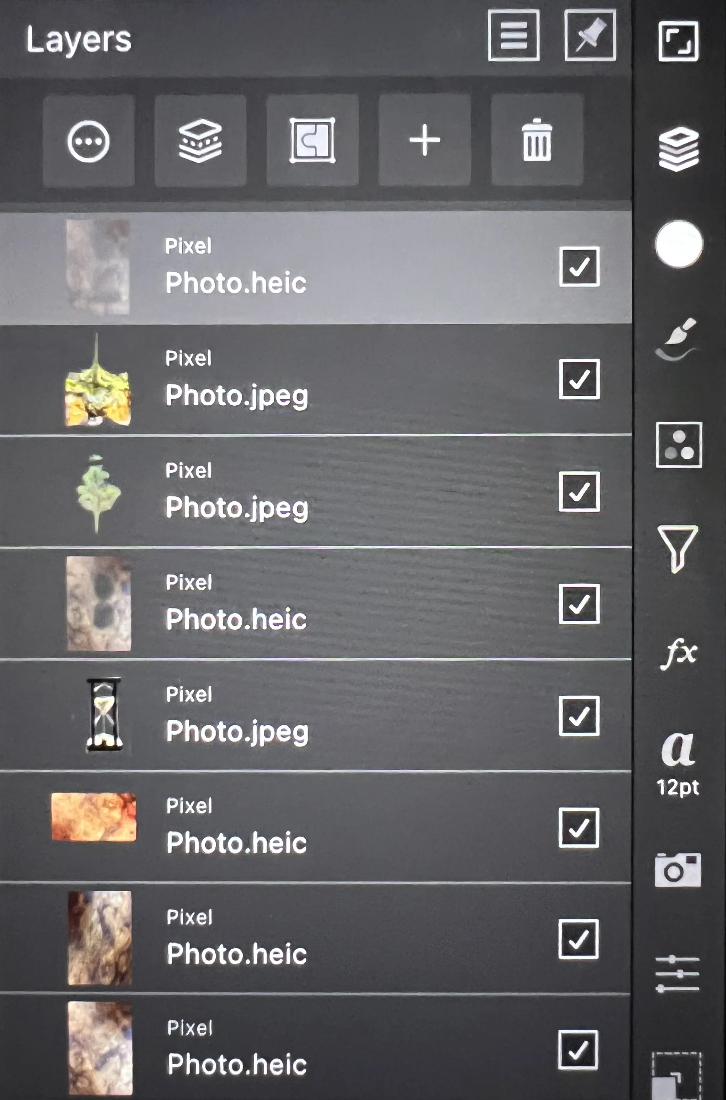
I had a lot of fun creating this image once I figured out what I wanted to do. I had several ideas of old and new that I could use, but I really love the Tree of Life at Kalaloch beach, and I wanted to capture the idea of the passage of time. Who knows how much longer it will be before the bank erodes away and the tree collapses into the sand? The final image was made by combining four photos in eight layers. The hourglass, sapling, and tree were taken with my Sony A7r iv and Tamron 28-70mm lens. The background image is a photo of my slate coffee table, taken with my iPad camera.
Images were processed using Adobe Lightroom, and Affinity Photo on my iPad. I am just beginning to learn Photoshop, so the layers were all done with Affinity Photo which is a similar, but much simpler program. Since I have an iPencil to use with the iPad, I have good control over blending tools and brushes.
Set up for Hourglass
I wanted to make sure I had minimal glare and reflection so I used black foam kneeling pads to block the light from above. I back lit the hourglass using a macro ring light and my cell phone flashlight bouncing off white foam core. I cropped and cleaned up the image using Lightroom, then imported into Affinity Photo.
The Layers
This is the part that took the most time. I imported all the images into Affinity photo. The background texture layers were three variations of the same image. Next came the hourglass, which was edited to show only the hourglass on a transparent background. Then I added the layer with the texture at reduced opacity with openings erased for the trees. Next I added the tree layers, and once in place, I used the transform tool to stretch the top and bottom into the narrow space to look as if they were flowing with the sand. The final layer was a reduced opacity layer of the texture. The most challenging part of creating the final image was blending the layers and the edges of the places I erased so that the final image would not look like it was cut and paste.


